Sunday, February 21, 2016
Sunday, October 25, 2009
Tuesday, October 13, 2009
Video_Test#
I fixed up the camera angle, the girl is fixed in the last 3 scenes but not the first 2, at the moment she suddenly jumps between poses so that needs to be fixed.
Monday, October 12, 2009
Weak Poses
Saturday, October 10, 2009
Video_Test_2
13th October
This one is much better than the first animation in my opinion. I stuck in a whole scene at the start just to show punchy getting angry. The end is probably still a tad to fast, my main issue now is that I havn't animated the girl in the background, I'm thinking about just making her legs swing, when the key hits the cage she gets a shock and kinda falls back abit.
14th October
I ran the video by a few people who pointed out a great array of technical and asthetical issues with it. I'll just list them in order of importance.
1. Character Issue: The girl in the back does not currently suit the princess I described.
Fix, I'll fix this by making her sit up in her cage, she'll be quietly attempting to pick the lock in the background, then when the key hits she'll get a surprise or something.
2. Camera Issue: When Punchy pulls back his hand to slap the cup, his fingers need to flex back, also instead of zooming the camera towards the hand making it look jerky and a not so nice, I'll cut it to an angle behind his shoulder and the hand will come towards the camera, then the camera will follow the hand as he swipes the cups. I also have to fix the timing so that it feels more aggressive.
3. Wrists Issues: The wrists were a common problem in a most people's feedback, this is just a problem throughout the whole movie on all the characters, I just have to go through and fix them all up a bit.
Tuesday, September 29, 2009
Animation Test
This was my first run through with the animation, basically sucks because the timing is way too fast, there is hardly any thought process, Punchy just punches the table within the first half second of the animation which is stupid, I need to add a lot more thinking time in there, basically slow it all down a notch. The camera angles I'll keep and the storyline.
Monday, September 21, 2009
Animatic
This is my final story, After talking to Chris I decided that I needed to fix a few of the camera angles because I made a few classic mistakes, mainly the camera switching from one side to another making it confusing for the viewer. Secondly its way too long, I've decided to only use the final scene as my final animation starting from where Punchy bashes the table. I also need to focus on facial expressions to show the thought process, here timing is very important to allow the viewer to see that the characters are thinking. (this means, blinking, frowning, scowling, smiling) and according to Richard Williams Book "Animators Survival Kit" which has played as my main reference throughout this assignment there shouldn't be any other actions during these facial expressions, it should be pause, expression then the action not, action and at the same time expression.
Camera Angle Reference: After reading the article on camera angles provided by Chris in the tutorial, http://www.peachpit.com/articles/printerfriendly.aspx?p=31096, I found that I had made a few mistakes that needed fixing, my main mistake is the camera switching around to random angles making it confusing for the viewer to understand the scene. In my main animation I need to show Punchy getting angry so I will begin with a close up of him
"close-ups not only help tell the story, but save time. The close-up shot also allows the viewer to see the emotion of the character, which is important to telling the story. The close-up shot can vary, depending on the composition.
" (referenced from the tutorial)
I will keep one or two medium shots which capture all three characters to give a viewer an idea about the layout of the scenery. One shot that I like is where Punchy is on the left, Slink is on the right and the Princess can be seen between them in the background, they're looking at each other, fighting over the princess between them.
"The medium shot is a general, all-purpose shot. Medium shots are used for dialogue sequences, and they allow the viewer to pick up on the character's movements and gestures. Body language is important to conveying emotion, and the medium shot remains close enough to capture that emotion. Medium shots are also good for small group shots, such as a conversation between characters. The medium shot often is partnered with a close-up shot, because it is not necessarily used for establishing shots. Medium shots are best for individuals or small groups; more than three or four people in the scene will require you to use a different type of shot. Figure 4 shows a typical medium shot."

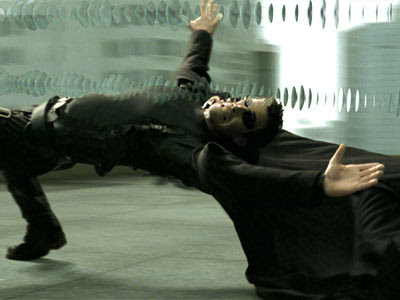
The style of camera shots was mainly inpired from The movie "The Matrix", I especially used the techniques used in the bullet time shots when Neo is dodging the bullets, this can be seen when the cup is flying in the air and the key lands inside the cup.
Subscribe to:
Comments (Atom)
